The First 10 Seconds: Who Stays, Who Bounces, Who Brings Friends
The first few seconds after a click act like a tiny, ruthless focus group. In our run of 1,000 clicks we saw a clean split within ten seconds: some visitors locked on the headline and scrolled as if they had arrived at exactly the thing they needed, others hit the back button so fast it looked automated, and a select few paused, smiled, and reached for the share button. That initial slice of time exposes the single clearest truth about any link driven traffic: whatever is above the fold must answer a visitor question in less time than it takes to make coffee. If that answer is fuzzy, slow, or boring, the bounce rate spikes and momentum dies before it gets started.
Who stays is usually the person who finds immediate clarity and momentum. That means a bold, specific promise, a clear visual hierarchy, and a tiny first interaction that confers value—think a one-line benefit, an image that explains not decorates, or a micro quiz that yields a fast, relevant result. Who bounces is often thwarted by performance friction: slow images, confusing navigation, or a headline that tries to be clever instead of useful. Quick wins: shave milliseconds off load time, show the core benefit in one glance, remove navigation noise on landing pages, and use skeleton loading to avoid blank screen panic. Those moves reliably shift the early-time survival curve in favor of engagement.
Then there are the visitors who bring friends. They are motivated by usefulness, reward, or the chance to look helpful. These are the people who will copy, DM, or post if you make sharing frictionless and rhetorically tempting. Add one-click share actions, prefilled copy that makes the recommender look smart, social proof snippets showing real results, and optional referral rewards that respect user attention. If you want to turn that organic referral instinct into a repeatable channel, surface a lightweight invite right after the first positive interaction. For a practical place to explore referral and micro task ideas that convert, check out best micro job sites for inspiration on low-friction earning and sharing models.
If you treat the first ten seconds like a funnel test rather than a guessing game you can run fast experiments with immediate payoff. A simple plan: create two headlines, measure micro conversions at 5 and 10 seconds, A/B test a stripped-down versus full UI, and track share clicks as a separate conversion event. Capture time to first interaction, not just time on page, and measure how many of those early interactors generate a downstream action or referral within 24 hours. Repeat, iterate, and reward the tiny wins. The result is less guesswork and more visitors who stay, engage, and sometimes even bring friends along for the ride.
CTR vs. Conversion: The Plot Twist Nobody Tells You About
When you blast 1,000 clicks at one link, the obvious thing to watch is click-through rate — because clicks look shiny and measurable. But what we learned from the experiment is the click is only the opening act. A sky-high CTR can still fizzle if the audience, offer, or landing experience aren't aligned. Think of clicks like invitations: getting thousands of people through the door is great, but if the room is dark, crowded, or selling something they didn't come for, most will leave before you hand them a brochure. That's the plot twist nobody tells you: CTR is permission to start a conversation, not the contract that closes the deal.
The mismatch shows up in predictable ways. Traffic quality can be poor (bot clicks or uninterested browsers), creative can promise one thing and the landing page delivers another, or tiny frictions — a slow load, a confusing headline, a mismatched form — shave conversions down to crumbs. Diagnose by pairing click data with session-level signals: bounce rate, time on page, scroll depth and form abandonment. Inspect your UTMs and source mix; a high CTR from an off-brand placement often equals low intent. And don't forget device: mobile visitors click differently and abandon faster if the checkout isn't finger-friendly.
Measurement choices make the story either clear or muddled. CTR lives in the ad platform; conversions live in the product or CRM; attribution windows, cross-device behavior, and event definitions wreck comparisons if they're misaligned. Move from vanity to value by tracking micro-conversions (email signups, demo clicks, add-to-cart) and the ultimate business metric (revenue per click or cost per acquisition). Set up event tracking and heatmaps, segment by channel and creative, and use session recordings to see where people stumble. Then run focused A/B tests: change the headline, tighten the value prop, remove a field, or add a micro-commitment that filters out low-intent clicks.
Here's a compact playbook to turn those 1,000 clicks into meaningful outcomes: 1) Verify intent: audit sources and pause placements with high CTR but zero downstream activity; 2) Align promise to landing: make the ad claim and the first fold identical in language and offer; 3) Reduce friction: cut steps, speed up load time, and test shorter forms; 4) Measure right: swap CTR as your North Star for revenue-per-click and CPA, and instrument micro-conversions to iterate faster. In short, celebrate clicks, but court conversions — clicks get people in the room, conversions make the room pay rent.
Mobile vs Desktop: Where Your Clicks Go to Convert (or Die Trying)
We poured 1,000 clicks into one lonely link and watched the split-screen drama unfold: mobile grabbed the bulk of attention while desktop quietly closed deals. The headline is not that one device is evil and the other is saintly, but that they behave like different marketing animals. Mobile is impulsive, swipe-happy, and easily distracted; desktop is deliberate, comparison-friendly, and often on the way to a purchase. That divide means the same creative, funnel, and offer will perform very differently depending on the device carrying the click.
Our experiment made that explicit. Desktop visitors converted at roughly double to triple the rate of mobile visitors on the exact same landing page. The reasons were classic: slower perceived load times on phones, cramped form fields, payment friction, and context—mobile users were on the go and frequently interrupted. On desktop, people had time to read testimonials, open a second tab to compare pricing, and complete longer forms without fat-finger frustration. Those are not excuses; they are optimization opportunities with measurable ROI when you treat mobile and desktop as separate conversion paths.
So what should you do right now to stop clicks from dying before checkout? Start by segmenting traffic and applying device-specific fixes. Prioritize speed and clarity on mobile, but do not forget the persuasive power of extra content on desktop. Small changes unlock big wins: reduce form fields on phones, enable autofill, move critical CTAs above the fold, and make your payment flow resilient to interruptions. For desktop, experiment with trust signals, comparison tools, and clearer breakdowns that justify a higher-ticket purchase. Here are three fast wins you can implement in the next sprint:
- 🚀 Speed: Audit load time and shave off third-party scripts, lazy-load images, and use a mobile-first CDN strategy so mobile visitors see actionable content within a second or two.
- 🐢 Forms: Replace multi-field signups with progressive capture: ask for an email first, then collect details later; use large tappable inputs, keyboard hints, and one-touch options like Google or Apple autofill.
- 🤖 Payment: Offer device-friendly payment methods (digital wallets on mobile, clear invoice options on desktop) and a persistent cart so interruptions do not kill conversion.
At the end of that 1,000-click story, the lesson was simple and liberating: stop pretending all clicks are equal. Treat device as a primary segmentation variable, run short A/B tests targeted by device, and reallocate spend towards the funnel that gives you the best path to revenue. Let the data guide you, tune the experience per device, and watch otherwise wasted clicks turn into customers.
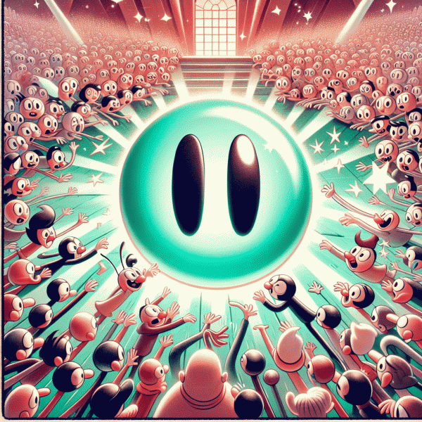
Virality Chain Reaction: How 1,000 Clicks Turn Into 10,000 Impressions
Think of those first 1,000 clicks as a lit match dropped into a dry field. The initial flame is the direct traffic, but what turns fire into a controlled burn is the pattern of sharing, algorithmic nudges, and quick follow up. Each click is an opportunity not just to convert a visitor but to convert a viewer into an amplifier. If the experience is sticky enough to trigger sharing, commenting, or saves, platforms treat that as oxygen: they hand out extra reach. That is the chain reaction in practice — behavior creates signals, signals trigger distribution, distribution creates impressions beyond the original click pool.
Here is a simple, realistic math model to illustrate how 1,000 clicks can scale into roughly 10,000 impressions. Assume a modest 20 percent share or advocate rate from those clickers: that yields 200 people who share or mention the link. If each of those people has 200 followers or friends and only 10 percent of those followers actually see the post, that is 200 x 200 x 0.10 = 4,000 impressions contributed by shares. Now layer on platform amplification: high early engagement raises the content in feeds and suggestions, which can add another 5,000 to 6,000 impressions in the next 24 to 72 hours. Add the original 1,000 direct views and you are closing in on a 10,000 impression outcome. The exact numbers change by niche, timing, and creative, but the multiplier concept stays the same.
Make the chain reaction more likely with a few practical moves. First, design one clear action for the visitor: share, save, or tag. Second, build social proof into the landing moment so people feel confident amplifying it; show counts, quotes, or quick testimonials. Third, optimize the preview — a bold headline and image increase the chance that a share converts into an impression. Fourth, activate micro-influencers and super-fans early to create that initial momentum signal. Fifth, follow up immediately with retargeted ads or email to re-engage visitors and boost engagement metrics that platforms read as relevance. Each step increases either the share rate, the follower reach per share, or the platform boost multiplier.
Quick checklist to run as you send your first 1,000 clicks: 1) craft a single, irresistible micro-hook; 2) add one explicit sharing CTA; 3) optimize the open-graph image and headline; 4) seed the link with 5 to 10 advocates; 5) watch engagement in the first 2 hours and amplify what works. If you treat clicks as the beginning of a social domino setup rather than the end game, that 1,000 can quietly seed 10,000 impressions and beyond. Measure, iterate, and treat each amplification as a hypothesis to test — virality is messy, but it is also engineerable.
Fix-It Fast: 5 Micro-Tweaks That Rescue Leaky Funnels
Funnels leak because tiny annoyances compound into big losses. Rather than launching a full redesign, apply five surgical micro-tweaks that you can implement between coffee breaks and still call it work. Start by decluttering the hero: one crisp headline, one visual, and a single, undeniable CTA—people skim, they don't enroll in sequels. Remove the top navigation on landing variants so attention funnels toward the action. Next, treat forms like a negotiator—ask only for what's mission-critical (email + one field is a sweet spot), enable autofill, and give a progress hint for multi-step flows so users don't bail out of impatience.
These small moves are fast to ship and easy to measure. Run a quick session-recording sweep to spot hesitation hotspots, and check heatmaps to confirm eyes and clicks align. If a button is getting clicks but not conversions, tweak the microcopy: change from Learn more to Get my free audit or Reserve my spot and watch intent crystallize. The idea is greedy for wins: ship tiny changes, capture immediate signals, then iterate.
- 🆓 Speed Patch: Lazy-load images, compress assets, and defer third-party scripts—dropping 300–500ms can instantly convert indecision into action.
- 🐢 Micro-Trust: Add a single-line guarantee, a verified badge, or one short testimonial above the fold—credibility nudges stalling visitors over the edge.
- 🚀 CTA Tweak: Test verb, color, and placement together; a more specific verb plus contrast often outperforms vague CTAs by 10–30%.
If you don't have in-house bandwidth to run these fast experiments, hire someone for short, focused tasks via freelance platforms for micro jobs. Briefs should be three sentences: objective, acceptance criteria, and the metric to track. Typical micro-jobs include trimming hero copy, setting up A/B tests for CTAs, implementing lazy-loading, or adding a single testimonial. Expect quick turnarounds and deliverables you can wire straight into your analytics—no lengthy spec documents required.
Finally, treat every tweak as a micro-experiment: run 3–7 day A/Bs, track micro-conversions (CTA CTR, form completion rate, time-to-first-click), and only stack winners. If a change beats control by a reliable margin, roll it into the funnel and re-run a sanity check. Do five focused micro-tweaks this week, measure tiny wins, and your overall conversion curve will stop looking like a sieve and start behaving like a machine. It's efficient, satisfying, and—best of all—you get to keep the bragging rights when the leak is fixed.